
Travel Tips Component Redesign for Amtrak
Working within an established design system to redesign a confusing and unintuitive component and help Amtrak.com users discover more ways to travel.


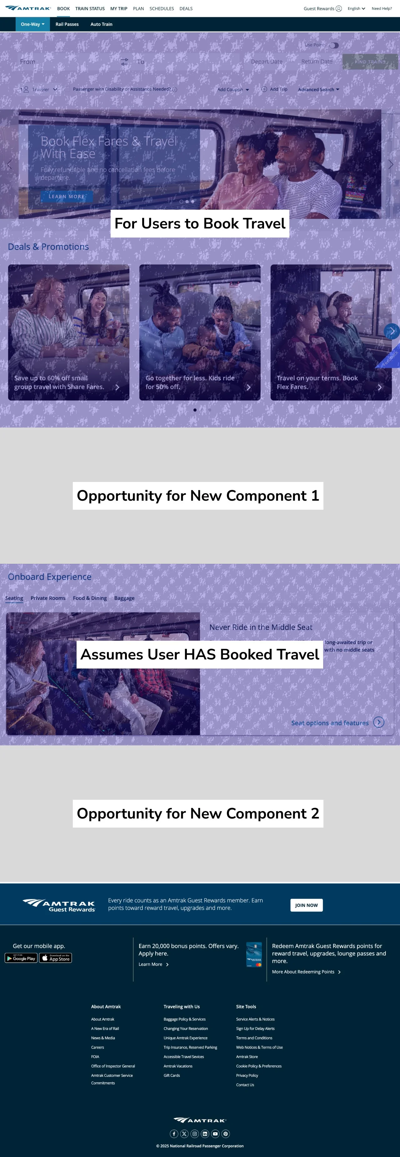
Towards the bottom of the homepage of Amtrak.com, there is a component referred to as “Travel Tips”. This component houses links to a diverse set of functionality on the site and is meant to help users discover more ways to engage with Amtrak. However, reviewing analytics data, we noticed that users often skip this component entirely, and there were very few specific interactions with it.
After conducting a series of interviews, we determined that the component itself, and the information housed within, were confusing to most users.
Meet “Travel Tips”
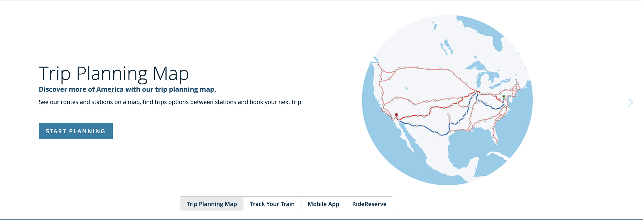
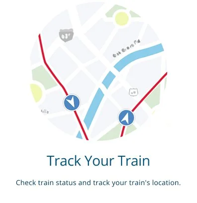
While reviewing the four items in the “Travel Tips” component, I noticed that three of them (“Trip Planning Map”, “Mobile App”, and “RideReserve”) were meant for users who had yet to book travel, while “Track Your Train” would only be relevant to users who already had a specific train in mind, and thus, likely already had travel plans. That gave me the idea to split “Travel Tips” into two components, one for users planning travel and one for those who had already booked travel.
Given that I was reorganizing content around a customer lifecycle model, I took the opportunity to review the homepage hierarchy to find the best placement for my two components.
Rebalancing the Page
Introducing the “Plan Your Trip” Masonry Grid
I created a masonry grid titled “Plan Your Trip” for the three items from “Travel Tips” that served the “pre-trip” audience and created unique displays tailored to each piece of content.
For the Trip Planning Map, I hid the image, as it didn’t communicate a ton of meaning, and instead included a text search field that could jump users to a search results page within the map experience.
For RideReserve, I re-wrote the content associated with this component to speak more to the average user. As I’ve mentioned before, content goes a long way in ensuring an accessible site experience, so I wanted to show how using plain language that speaks to a user’s objective can improve even a simple component. There’s no mention of “RideReserve” in my redesign, which I interpreted to be internal language rather than something users would recognize. This is an assumption, though, so I wanted the component to be easy to update in the event that I should find out that RideReserve users are very familiar with that product name.
Finally, for the Amtrak app, I designed a space within the masonry grid that echoes the other marketing-oriented component on the homepage (the Amtrak Guest Rewards Banner) by using the dark navy fill to add weight and contrast the rest of the page. I wanted to strengthen the value proposition of downloading the app by including a few scannable benefits that highlight the utility of the app while making the component actionable through the download buttons. This was a deliberate decision to forgo the existing Amtrak app marketing page, and instead, simplify that full page experience into a single homepage component.
For “Track Your Train”, I assumed the use case would either be people who are currently mid-travel, (either on a train or waiting to board) that are wondering if things are going as planned, or those who are attempting to coordinate a pickup from a train station. With that in mind, I looked to airports and airlines for inspiration as to how I could increase the utility of this component. I ended up creating a display that draws from the existing “Train Status” search from the main navigation and also my newly redesigned “Trip Planning Map” component by adding a filterable search. I made a handful of additional design and content tweaks to aid discoverability, consistency, and comprehension.
Improving “Track Your Train”
Working within an established system and on such a visible component, I wanted to deliver documentation that could communicate my vision to anyone whether I was involved in the implementation or not. With that in mind, I developed a set of annotated wireframes that dissected the designs and helped potentially unfamiliar shareholders navigate the interactive prototypes.
Delivery and Documentation
This work was conducted as part of an interview assignment with Amtrak. Unfortunately, the role was eliminated as part of congressional budget cuts for digital services during the interview process.
Client: Amtrak
If you are or know a public sector designer looking for work, please do not hesitate to reach out, I’m always available to help however I can.